
Hallo sobat program, bertemu lagi dengan saya Rizal dan masih diwebsite Dumetschool, Pada kesempatan kali ini kita akan membahas tentang Cara Membuat Button Hover Text dengan HTML CSS. yang nantinya akan membuat hover menjadi sebuah text yang menarik.
Mungkin dipembahasan kali ini sudah cukup banyak ya tentang button hover effect atau yang lainnya, namun disini saya akan mencoba dengan menggunakan text dan sentuhan effect animasi dan pemanfaatan pseudo element. Dan Sebenarnya hanya untuk iseng saja hehe, ya mudah-mudahan bermanfaat dan berguna buat teman-teman.
Cara Membuat Button Hover Text dengan HTML CSS
Oke tanpa basa-basi lagi, mari kita langsung coba membuatnya ya teman-teman, pertama jalankan/run text-editornya kemudian ketiklah script seperti dibawah ini :
<a class='button centered' data-text='ARAHKAN KESINI »' href='#'> <span>T</span> <span>E</span> <span>R</span> <span>I</span> <span>M</span> <span>A</span> <span> </span> <span>K</span> <span>A</span> <span>S</span> <span>I</span> <span>H</span> </a>
Pada kode diatas saya menggunakan tag a untuk link yang nantinya saya design agar menjadi bentuk tombol dan span untuk digunakan saat dihover maka tampil. Oke langkah selanjutnya, tambahkan kode Style CSS nya seperti pada contoh dibawah ini :
<style>
@import url("https://fonts.googleapis.com/css?family=Roboto:900");
body {
  background: #ccc;
}

a {
  font-family: "Roboto", sans-serif;
  font-weight: bold;
  color: black;
  text-decoration: none;
}

.centered {
  position: absolute;
  left: 50%;
  top: 50%;
  transform: translate(-50%, -50%);
}

.button {
  background: white;
  border:1px dotted black;
  padding: 20px;
  width: 250px;
  text-align: center;
}
.button span {
  display: inline-block;
  min-width: 0.3em;
  text-transform: uppercase;
  transition: 0.25s cubic-bezier(0.5, -1, 0.5, 2);
  opacity: 0;
  transform: translate(0, -20px);
}
.button:before {
  content: attr(data-text);
  position: absolute;
  width: 100%;
  left: 0;
  transition: 0.25s cubic-bezier(0.5, -1, 0.5, 2);
  text-transform: uppercase;
  letter-spacing: 3.5px;
  opacity: 1;
  transform: translate(0, 0px);
}
.button:hover:before, .button:focus:before {
  opacity: 0;
  transform: translate(0, 20px);
}
.button:hover span, .button:focus span {
  opacity: 1;
  transform: translate(0, 0);
}
.button:hover span:nth-child(1), .button:focus span:nth-child(1) {
  transition-delay: 0.025s;
}
.button:hover span:nth-child(2), .button:focus span:nth-child(2) {
  transition-delay: 0.05s;
}
.button:hover span:nth-child(3), .button:focus span:nth-child(3) {
  transition-delay: 0.075s;
}
.button:hover span:nth-child(4), .button:focus span:nth-child(4) {
  transition-delay: 0.1s;
}
.button:hover span:nth-child(5), .button:focus span:nth-child(5) {
  transition-delay: 0.125s;
}
.button:hover span:nth-child(6), .button:focus span:nth-child(6) {
  transition-delay: 0.15s;
}
.button:hover span:nth-child(7), .button:focus span:nth-child(6) {
  transition-delay: 0.15s;
}
.button:hover span:nth-child(8), .button:focus span:nth-child(6) {
  transition-delay: 0.175s;
}
.button:hover span:nth-child(9), .button:focus span:nth-child(6) {
  transition-delay: 0.2s;
}
.button:hover span:nth-child(10), .button:focus span:nth-child(6) {
  transition-delay: 0.225s;
}
.button:hover span:nth-child(11), .button:focus span:nth-child(6) {
  transition-delay: 0.25s;
}
.button:hover span:nth-child(12), .button:focus span:nth-child(6) {
  transition-delay: 0.275s;
}

</style>
Jika sudah, maka hasil dari kedua script diatas menjadi seperti dibawah ini :
<html>
<head>
<meta charset="UTF-8">
<title>Button Hover Text</title>
<style>
@import url("https://fonts.googleapis.com/css?family=Roboto:900");
body {
background: #ccc;
}
a {
font-family: "Roboto", sans-serif;
font-weight: bold;
color: black;
text-decoration: none;
}
.centered {
position: absolute;
left: 50%;
top: 50%;
transform: translate(-50%, -50%);
}
.button {
background: white;
border:1px dotted black;
padding: 20px;
width: 250px;
text-align: center;
}
.button span {
display: inline-block;
min-width: 0.3em;
text-transform: uppercase;
transition: 0.25s cubic-bezier(0.5, -1, 0.5, 2);
opacity: 0;
transform: translate(0, -20px);
}
.button:before {
content: attr(data-text);
position: absolute;
width: 100%;
left: 0;
transition: 0.25s cubic-bezier(0.5, -1, 0.5, 2);
text-transform: uppercase;
letter-spacing: 3.5px;
opacity: 1;
transform: translate(0, 0px);
}
.button:hover:before, .button:focus:before {
opacity: 0;
transform: translate(0, 20px);
}
.button:hover span, .button:focus span {
opacity: 1;
transform: translate(0, 0);
}
.button:hover span:nth-child(1), .button:focus span:nth-child(1) {
transition-delay: 0.025s;
}
.button:hover span:nth-child(2), .button:focus span:nth-child(2) {
transition-delay: 0.05s;
}
.button:hover span:nth-child(3), .button:focus span:nth-child(3) {
transition-delay: 0.075s;
}
.button:hover span:nth-child(4), .button:focus span:nth-child(4) {
transition-delay: 0.1s;
}
.button:hover span:nth-child(5), .button:focus span:nth-child(5) {
transition-delay: 0.125s;
}
.button:hover span:nth-child(6), .button:focus span:nth-child(6) {
transition-delay: 0.15s;
}
.button:hover span:nth-child(7), .button:focus span:nth-child(6) {
transition-delay: 0.15s;
}
.button:hover span:nth-child(8), .button:focus span:nth-child(6) {
transition-delay: 0.175s;
}
.button:hover span:nth-child(9), .button:focus span:nth-child(6) {
transition-delay: 0.2s;
}
.button:hover span:nth-child(10), .button:focus span:nth-child(6) {
transition-delay: 0.225s;
}
.button:hover span:nth-child(11), .button:focus span:nth-child(6) {
transition-delay: 0.25s;
}
.button:hover span:nth-child(12), .button:focus span:nth-child(6) {
transition-delay: 0.275s;
}
</style>
</head>
<body>
<a class='button centered' data-text='ARAHKAN KESINI »' href='#'>
<span>T</span>
<span>E</span>
<span>R</span>
<span>I</span>
<span>M</span>
<span>A</span>
<span> </span>
<span>K</span>
<span>A</span>
<span>S</span>
<span>I</span>
<span>H</span>
</a>
</body>
</html>
Oke, langsung saja coba dijalankan/run dibrowser yang teman-teman gunakan. Jika benar maka hasilnya akan menjadi seperti pada gambar dibawah ini :
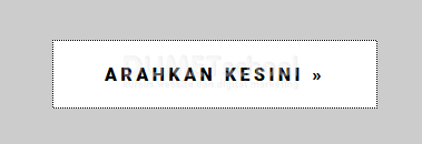
Jadi hover text akan tampil ketika cursor mengarah di button tersebut, hehe cukup mudah ya teman-teman ? jadi seperti itu contoh sederhana dalam Cara Membuat Button Hover Text dengan HTML CSS Silahkan di explore lagi ya teman-teman.
Oke kalau begitu cukup sekian pembahasan kali ini tentang Cara Membuat Button Hover Text dengan HTML CSS semoga dapat bermanfaat dan sampai bertemu dipembahasan selanjutnya.
Terimakasih