
Salam hangat teman-teman, semoga teman-teman sehat selalu ya, Kali ini saya akan membagikan Cara Membuat Layout Website Responsive Tanpa Bootstrap.
Pasti teman-teman ingin tahu kan Cara Membuat Layout Website Responsive Tanpa Bootstrap. Ya bisa karena di CSS 3Â kita bisa menggunakan flex-wrap untuk membuat layout suatu website menjadi responsive.
Ok, langsung saja teman-teman saya akan memberikan bagaimana menggunakan flex-wrapnya :
– Ketikan codingan HTML di bawah ini:
<!DOCTYPE html>
<html>
<head>
	<title>FlexWrap</title>
	<link rel="stylesheet" type="text/css" href="style.css">
</head>
<body>
	<div class="wrapper">
	  <header class="header">Header</header>
	  <article class="main">
	    <p>Lorem Ipsum is simply dummy text of the printing and typesetting industry. Lorem Ipsum has been the industry's standard dummy text ever since the 1500s, when an unknown printer took a galley of type and scrambled it to make a type specimen book. It has survived not only five centuries, but also the leap into electronic typesetting, remaining essentially unchanged. It was popularised in the 1960s with the release of Letraset sheets containing Lorem Ipsum passages, and more recently with desktop publishing software like Aldus PageMaker including versions of Lorem Ipsum.</p>
	  </article>
	  <aside class="aside aside-1">SideBar 1</aside>
	  <aside class="aside aside-2">SideBar 2</aside>
	  <footer class="footer">Footer</footer>
	</div>
</body>
</html>
– Lalu Ketikan codingan css di bawah:
.wrapper {
  display: -webkit-box;
  display: -moz-box;
  display: -ms-flexbox;
  display: -webkit-flex;
  display: flex;
  -webkit-flex-flow: row wrap;
  flex-flow: row wrap;
  font-weight: bold;
  text-align: center;
}

.wrapper > * {
  padding: 10px;
  flex: 1 100%;
}

.header {
  background: #6699ff;
}

.footer {
  background: #d6d6c2;
}

.main {
  text-align: left;
  background: #a6ff4d;
}

.aside-1 {
  background: #33ff99;
}

.aside-2 {
  background: #66ffff;
}

@media all and (min-width: 600px) {
  .aside {
    flex: 1 auto;
  }
}
@media all and (min-width: 800px) {
  .main {
    flex: 3 0px;
  }

  .aside-1 {
    order: 1;
  }

  .main {
    order: 2;
  }

  .aside-2 {
    order: 3;
  }

  .footer {
    order: 4;
  }
}
body {
  padding: 2em;
}
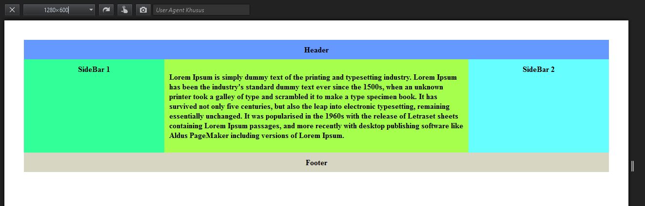
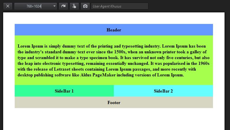
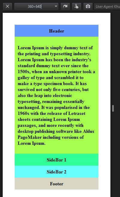
Ya sekarang kita lihat hasilnya di browser :
Tampilan pada desktop
Tablet
Smartphone :
Bagaiman teman-teman mudahkan Cara Membuat Layout Website Responsive Tanpa Bootstrap. Sekian tutorial dari saya, semoga bermanfaat. Sehat selalu ya teman-teman.