
Hallo teman-teman, bertemu lagi dengan saya di website ini. Semoga di hari yang cerah dan indah ini teman-teman masih di berikan nikmat dan kesehatan. Pada kesempatan kali ini saya akan membahas tentang cara Membuat Animasi 404 dengan HTML dan CSS.
Sebelum kita mulai teman-teman harus sudah lebih dahulu mengenal dengan HTML dan CSS agar teman-teman tidak terlalu sulit dalam mengikuti tutorial ini.
Oke langsung saja kita mulai pertama-tama seperti biasa siapkan dahulu text-editornya lalu kemudian ketik script HTML dibawah ini :
<div class="conatiner"><span class="numer">4</span>
  <div class="circle">
    <div class="drops"></div>
    <div class="drops"></div>
    <div class="hand"></div>
    <div class="hand rgt"></div>
    <div class="holder">
      <div class="bob">
        <div class="nose"></div>
        <div class="face">
          <div class="mouth">
            <div class="tongue"></div>
          </div>
        </div>
        <div class="ear"></div>
        <div class="ear rgt"></div>
        <div class="neck"></div>
      </div>
    </div>
  </div><span class="numer">4</span>
</div>
Jika sudah simpan file HTML nya, lalu kemudian langkah selanjutnya ketik script CSS dibawah ini, teman-teman boleh menggunakan CSS internal ataupun External:
*, *:after, *:before {
  box-sizing: border-box;
}

body {
  text-align: center;
  background: #03a9f4;
}

.conatiner {
  position: absolute;
  left: 50%;
  top: 50%;
  -webkit-transform: translate(-50%, -50%);
  transform: translate(-50%, -50%);
  width: 900px;
}

.circle {
  border-radius: 50%;
  padding: 0;
  display: inline-block;
  position: relative;
  height: 375px;
}
.circle:after {
  content: '';
  position: absolute;
  left: 0;
  top: 0;
  width: 100%;
  height: 100%;
  border: 40px solid #fffbdf;
  z-index: 50;
  border-radius: 50%;
}

.holder {
  overflow: hidden;
  width: 366px;
  height: 345px;
  border-radius: 50%;
  position: relative;
}

.bob {
  position: absolute;
  display: inline-block;
  left: 50%;
  z-index: 10;
  -webkit-transform: translateX(-50%);
  transform: translateX(-50%);
  -webkit-animation: 2s updown ease-in infinite;
  animation: 2s updown ease-in infinite;
  top: 100%;
}
.bob .nose {
  position: relative;
  background: #fdd5b6;
  border: 3px solid #602f2d;
  margin: 0 auto;
  height: 35px;
  width: 35px;
  z-index: 15;
  border-radius: 50% 50% 0 0;
  top: 8px;
}
.bob .nose:after {
  content: '';
  position: absolute;
  left: 5px;
  top: 12px;
  height: 7px;
  width: 7px;
  border-radius: 50%;
  background: #602f2d;
  box-shadow: 13px 0 #602f2d;
}
.bob .face {
  width: 200px;
  height: 200px;
  background: #fdd5b6;
  border: 3px solid #602f2d;
  border-radius: 50%;
  position: relative;
  z-index: 50;
  box-shadow: 15px 0 #f7c6a4 inset;
}
.bob .ear {
  position: absolute;
  background: #fdd5b6;
  border: 3px solid #602f2d;
  width: 40px;
  height: 40px;
  border-radius: 50%;
  z-index: 15;
  top: 115px;
  left: -5px;
}
.bob .ear:after, .bob .ear:before {
  content: '';
  position: absolute;
  background: #602f2d;
  border-radius: 15px;
  height: 3px;
  width: 20px;
  top: 12px;
  left: 5px;
}
.bob .ear:after {
  -webkit-transform: rotate(127deg);
  transform: rotate(127deg);
  width: 7px;
  top: 15px;
  left: 7px;
}
.bob .ear.rgt {
  left: auto;
  right: -5px;
}
.bob .ear.rgt:after {
  -webkit-transform: rotate(47deg);
  transform: rotate(47deg);
  top: 15px;
  left: 18px;
}
.bob .neck {
  position: relative;
  background: #fdd5b6;
  border: 3px solid #602f2d;
  margin: 0 auto 0;
  height: 50px;
  width: 70px;
  z-index: 15;
  border-radius: 0 0 50% 50%;
  top: -8px;
  box-shadow: 10px 0 #f7c6a4 inset;
}
.bob .mouth {
  position: absolute;
  border: 3px solid #602f2d;
  background: #ec7374;
  width: 80%;
  height: 80%;
  left: 0;
  top: 0;
  bottom: 0;
  right: 0;
  margin: auto;
  border-radius: 50%;
  overflow: hidden;
  -webkit-animation: 1s openclose ease-in infinite;
  animation: 1s openclose ease-in infinite;
}
.bob .mouth:after, .bob .mouth:before {
  content: '';
  position: absolute;
  background: #cc5e64;
  border: 5px solid #df6062;
  border-radius: 50%;
  bottom: 0;
  left: 0;
  right: 0;
  margin: auto;
  width: 120px;
  height: 120px;
  z-index: 2;
}
.bob .mouth:after {
  z-index: 10;
  bottom: auto;
  top: 25px;
  background: #ec7374;
  height: 40px;
  width: 40px;
  border-top-color: transparent;
}
.bob .tongue {
  position: absolute;
  background: #602f2d;
  width: 40px;
  height: 40px;
  left: 0;
  bottom: 5px;
  right: 0;
  margin: auto;
  border-radius: 50%;
  z-index: 5;
}
.bob .tongue:after, .bob .tongue:before {
  content: '';
  position: absolute;
  background: #f9adba;
  border: 3px solid #602f2d;
  border-radius: 50px;
  top: 22px;
  left: -4px;
  width: 30px;
  height: 40px;
  z-index: 2;
}
.bob .tongue:before {
  left: 16px;
}

.drops {
  background: #8ecbf9;
  border: 2px solid #602f2d;
  width: 20px;
  height: 20px;
  border-radius: 50px 50px 0 50px;
  position: absolute;
  -webkit-transform: rotate(-15deg);
  transform: rotate(-15deg);
  top: 150px;
  left: 70px;
  z-index: 100;
  -webkit-animation: 2s drop-l ease-in infinite;
  animation: 2s drop-l ease-in infinite;
}
.drops:nth-child(2) {
  left: auto;
  right: 70px;
  -webkit-transform: rotate(145deg);
  transform: rotate(145deg);
  -webkit-animation: 2s drop-r ease-in infinite;
  animation: 2s drop-r ease-in infinite;
}
.drops:after, .drops:before {
  content: '';
  background: #8ecbf9;
  border: 2px solid #602f2d;
  width: 20px;
  height: 20px;
  border-radius: 50px 50px 0 50px;
  position: absolute;
  -webkit-transform: rotate(-15deg);
  transform: rotate(-15deg);
  top: 20px;
  left: -25px;
}
.drops:before {
  top: -30px;
  left: 0px;
}

.hand {
  border: 3px solid #602f2d;
  position: absolute;
  z-index: 50;
  background: #fdd5b6;
  width: 25px;
  height: 15px;
  border-radius: 20px;
  bottom: 86px;
  z-index: 200;
  left: 64px;
  -webkit-transform: rotate(-36deg);
  transform: rotate(-36deg);
}
.hand:after, .hand:before {
  content: '';
  border: 3px solid #602f2d;
  position: absolute;
  z-index: 50;
  background: #fdd5b6;
  width: 25px;
  height: 15px;
  border-radius: 20px;
  z-index: 200;
  top: 100%;
  left: 0;
}
.hand:before {
  top: 200%;
}

.rgt {
  left: auto;
  right: 60px;
  bottom: 96px;
  -webkit-transform: rotate(50deg);
  transform: rotate(50deg);
}

.numer {
  font-size: 500px;
  display: inline-block;
  color: #fffbdf;
}
@-webkit-keyframes updown {
  50% , 70% {
    top: 25%;
  }
}
@keyframes updown {
  50% , 70% {
    top: 25%;
  }
}
@-webkit-keyframes openclose {
  0% , 100% {
    -webkit-transform: scale(0.95, 0.95);
    transform: scale(0.95, 0.95);
  }
  50% {
    -webkit-transform: scale(1.1, 1.1);
    transform: scale(1.1, 1.1);
  }
}
@keyframes openclose {
  0% , 100% {
    -webkit-transform: scale(0.95, 0.95);
    transform: scale(0.95, 0.95);
  }
  50% {
    -webkit-transform: scale(1.1, 1.1);
    transform: scale(1.1, 1.1);
  }
}
@-webkit-keyframes drop-l {
  0% , 50% {
    opacity: 0;
    -webkit-transform: translate(50px, 0) rotate(-15deg);
    transform: translate(50px, 0) rotate(-15deg);
  }
  55% {
    opacity: 1;
    -webkit-transform: translate(0, 0) rotate(-15deg);
    transform: translate(0, 0) rotate(-15deg);
  }
  70% {
    opacity: 1;
    -webkit-transform: translate(-30px, 0) rotate(-25deg);
    transform: translate(-30px, 0) rotate(-25deg);
  }
  85% {
    opacity: 1;
    -webkit-transform: translate(-50px, 100px) rotate(-90deg);
    transform: translate(-50px, 100px) rotate(-90deg);
    opacity: .5;
  }
  86% , 100% {
    opacity: 0;
  }
}
@keyframes drop-l {
  0% , 50% {
    opacity: 0;
    -webkit-transform: translate(50px, 0) rotate(-15deg);
    transform: translate(50px, 0) rotate(-15deg);
  }
  55% {
    opacity: 1;
    -webkit-transform: translate(0, 0) rotate(-15deg);
    transform: translate(0, 0) rotate(-15deg);
  }
  70% {
    opacity: 1;
    -webkit-transform: translate(-30px, 0) rotate(-25deg);
    transform: translate(-30px, 0) rotate(-25deg);
  }
  85% {
    opacity: 1;
    -webkit-transform: translate(-50px, 100px) rotate(-90deg);
    transform: translate(-50px, 100px) rotate(-90deg);
    opacity: .5;
  }
  86% , 100% {
    opacity: 0;
  }
}
@-webkit-keyframes drop-r {
  0% , 50% {
    opacity: 0;
    -webkit-transform: translate(-50px, 0) rotate(145deg);
    transform: translate(-50px, 0) rotate(145deg);
  }
  55% {
    opacity: 1;
    -webkit-transform: translate(0, 0) rotate(145deg);
    transform: translate(0, 0) rotate(145deg);
  }
  70% {
    opacity: 1;
    -webkit-transform: translate(30px, 0) rotate(160deg);
    transform: translate(30px, 0) rotate(160deg);
  }
  85% {
    opacity: 1;
    -webkit-transform: translate(50px, 100px) rotate(180deg);
    transform: translate(50px, 100px) rotate(180deg);
    opacity: .5;
  }
  86% , 100% {
    opacity: 0;
  }
}
@keyframes drop-r {
  0% , 50% {
    opacity: 0;
    -webkit-transform: translate(-50px, 0) rotate(145deg);
    transform: translate(-50px, 0) rotate(145deg);
  }
  55% {
    opacity: 1;
    -webkit-transform: translate(0, 0) rotate(145deg);
    transform: translate(0, 0) rotate(145deg);
  }
  70% {
    opacity: 1;
    -webkit-transform: translate(30px, 0) rotate(160deg);
    transform: translate(30px, 0) rotate(160deg);
  }
  85% {
    opacity: 1;
    -webkit-transform: translate(50px, 100px) rotate(180deg);
    transform: translate(50px, 100px) rotate(180deg);
    opacity: .5;
  }
  86% , 100% {
    opacity: 0;
  }
}
Jika sudah simpan file CSS dan HTML nya lalu kemudian teman-teman tinggal menjalankan/run dibrowser yang teman-teman gunakan. Maka hasilnya akan seperti pada gambar dibawah ini :
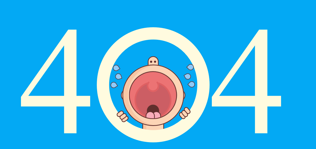
Jika hasilnya sudah seperti pada gambar di atas maka teman-teman dinyatakan telah berhasil dalam Membuat Animasi 404 dengan HTML dan CSS. Dan silahkan teman-teman kembangkan lagi sesuai keinginan teman-teman.
Oke sampai disini dahulu pembahasan tentang cara Membuat Animasi 404 dengan HTML dan CSS. Semoga dapat bermanfaat untuk teman-teman dan sampai bertemu di tutorial/pembahasan selanjutnya.
Terimakasih